Ah, Xiaomi. No phone brand has entered India and captured that much attention, as quickly. It’s fair to say that some of y’all outside of Asia probably have no idea about the brand, but chances are, if you’re even remotely interested in mobile tech, you’ve definitely heard of them. Established in 2010, the company now sells more handsets in China, than Samsung or even Apple. This is mostly because Xiaomi has done what no other Android phone manufacturer has managed to do before: create immense value-for-money smartphones that have little competition at their prices, and only sell online in ‘Flash sales’. For example, the Xiaomi Redmi 1S, and the Xiaomi Redmi Note which recently were on sale in India.
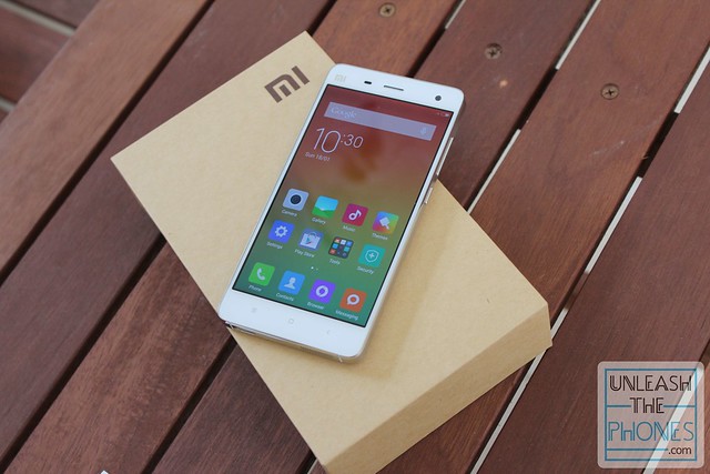
And their latest entry also happens to be the company’s current flagship, the Xiaomi Mi 4 which is going on sale here in India this February 10th.
Boasting a 5 inch, 1080p display, a powerful Snapdragon 801 processor, 3GB RAM, 13 megapixel rear camera, 8 megapixel front facing camera, and a 3080 mAh battery, this phone is incredibly tempting at just Rs 19,999 in India (the Mi 4 is priced at ¥1999 in China, or the equivalent of about $320).
Sound too good to be true? Here’s my Xiaomi Mi 4 Review.
The Unboxing:-
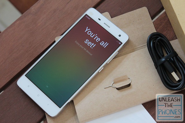
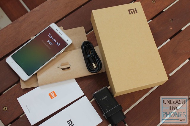
The Xiaomi Mi4 comes with what you’d expect to get with a flagship phone, including a charging adapter, microUSB-to-USB cable, SIM ejector tool, and user manual.
What’s strange is that there are no headphones included in the box, but that isn’t really a big deal since you can separately pick up the (incredibly affordable) Mi Piston 2 earphones online anyway, or an even better pair of headphones. Here’s a quick Mi 4 unboxing to give you a better idea:
The Design:-
It is pretty well established that most Chinese manufacturers always try to create clones of Apple products. Oppo, Lenovo, Vivo, Gionee, they all do it, though some more than others. It is the same story here with the Mi4, but while Xiaomi did borrow a detail or two, it is still different enough not to be confused for an iPhone.
While it might not be as unique as the Mi3 was, the Xiaomi Mi4 is a gorgeous phone, defined by a stainless steel frame that adds a lot of heft to its build quality.
Yes indeed, the Mi4 is very solid in terms of build quality, and there are no creaks or squeaks anywhere on the phone. But while it seems well equipped to handle an accidental bump or two, you’ll definitely want to take care not to drop this thing.
Weighing 149 grams and measuring 139.2 x 68.5 x 8.9 mm, the Mi4 is quite hefty, but is much easier to use one-handed than most other flagship phones nowadays.
That is mostly because Xiaomi chose to stick with a more sensible 5 inch display, instead of going overboard with a much larger one (as they’ve done in the new, phablet sized Xiaomi Mi Note).
The 5 inch 1080 x 1920 pixel resolution (441 ppi pixel density) IPS LCD display is made by either Sharp or JDI (a joint venture between Sony, Toshiba, and Hitachi). It is pretty sharp, and can get very bright. So bright, infact, that the Mi4’s display is even brighter than the AMOLED on the Galaxy S5, though not as bright as the iPhone 6 or HTC One M8’s display. It can also get really dim as well, so it won’t blind you or people around you when you’re using it in dark situations, like at the movies.
That all being said, the display isn’t perfect by any means. Color temperature seems to be a bit off, even with the optimal “Warm” color profile on. As a result, there’s a slightly purplish-blueish tint to the screen.
Lastly, it is also worth mentioning that the Mi 4’s display is very usable outdoors thanks to that high brightness, and the laminated cover glass is thankfully not as reflective as the Mi3’s display was.
Moving on to the rest of the phone, above the display you’ll find the centrally located earpiece, with the 8 megapixel front facing camera on the right side, and the ambient light sensor and proximity sensor on the left side of it. You’ll also see the “Mi” branding unnecessarily situated here.
Below the display, you’ll find the usual three capacitive Android touch keys for home, recent apps, and back. The keys work well enough and are white-backlit so they’re easy to use. As you’d expect, you can long-press the home button to get to Google Now, and long-press the recent apps button to get to the editing menu in apps or the homescreen.
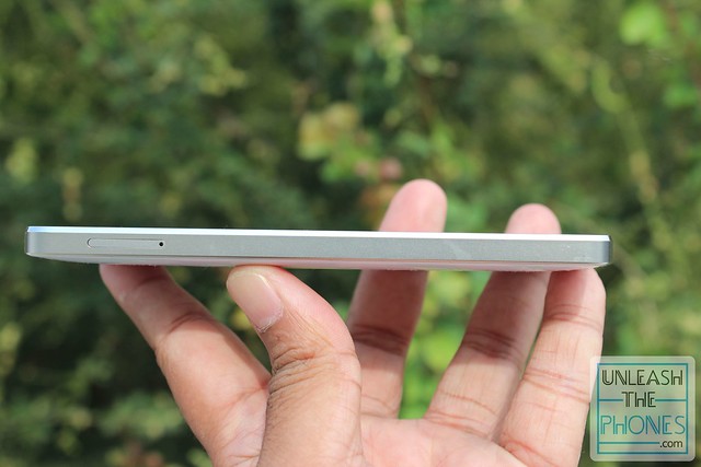
On the left side you’ll find just the lone SIM card tray. It is worth pointing out that the Mi4 has no microSD card slot unfortunately, and is a single-SIM device.
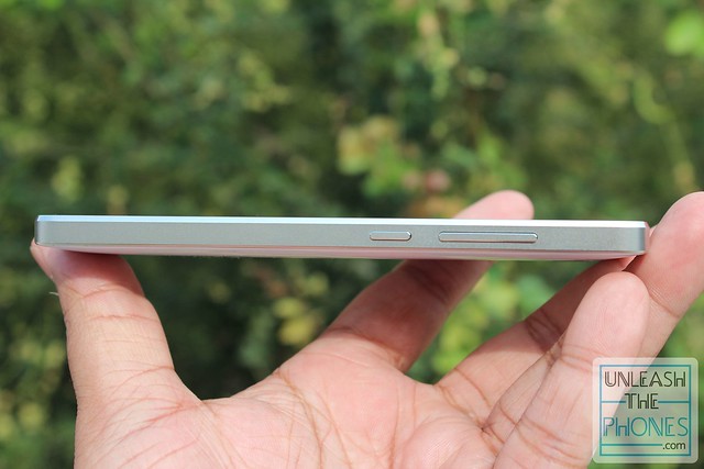
At the right side, you’ll find the metal volume rocket button and power/screenlock key which work great and have good tactile feedback.
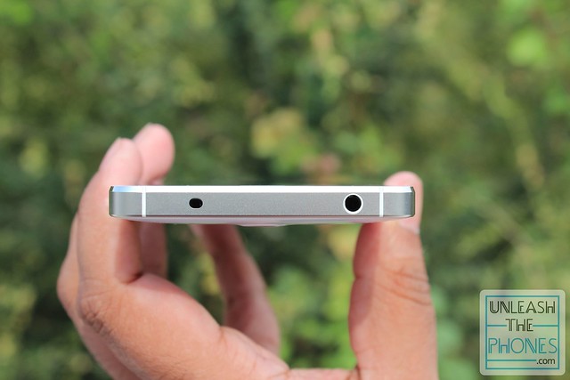
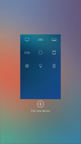
At the top, you’ll find the 3.5mm audio jack, and the infrared port which you can use to control home electronics.
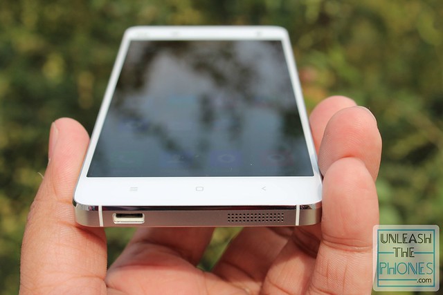
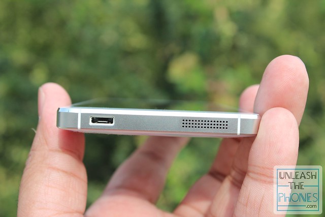
And at the bottom, you’ll find the microUSB charging port, and the speaker grille.
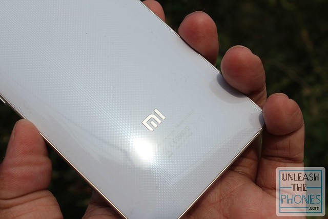
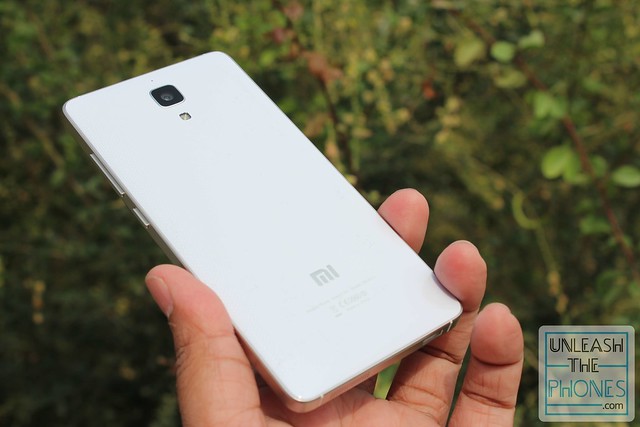
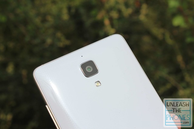
Coming to the back, the back panel is made out of glossy plastic, but it feels sturdy, with an attractive finish that has a diamond-like texture that makes the phone look much more premium. The back panel is removable, but the battery is non-removable, so there’s no real reason to take off the panel at all.
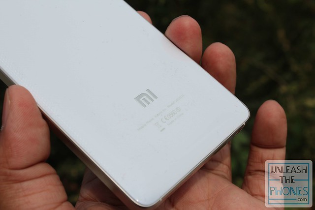
Here you’ll find just the camera module with the single LED flash below it, and the “Mi” logo towards the bottom.
All in all, the Xiaomi Mi4 design might not be entirely original, but it is still a very attractive smartphone that feels very solid in terms of build quality.
The Hardware:-
Xiaomi has always consistently pumped out smartphones with great performance, mostly in part due to the MIUI software combined with the hardware that the company chooses to use.
The Xiaomi Mi 4 continues this tradition, powered by a 2.5GHz quad-core Snapdragon 801 (with four Krait 400 cores), an Adreno 330 GPU, and 3GB of RAM.
As such, the Mi 4 is no slouch in terms of performance, and generally navigation is smooth and lag-free. Graphics-intensive games like Asphalt 8 play with no frame drops at all.
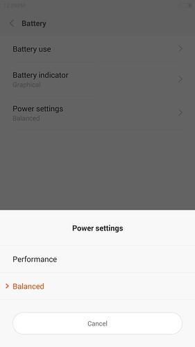
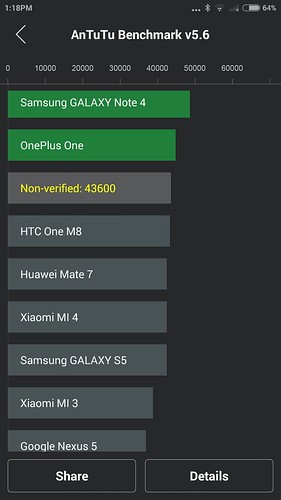
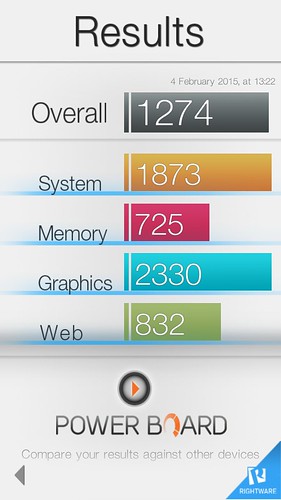
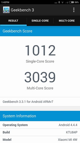
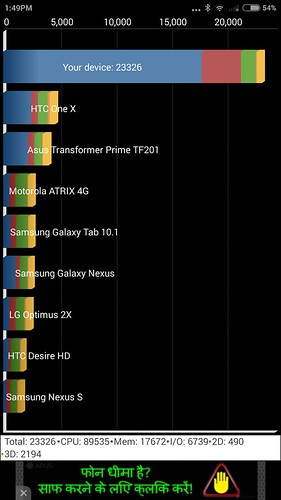
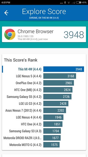
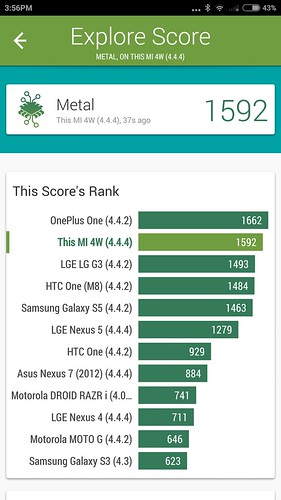
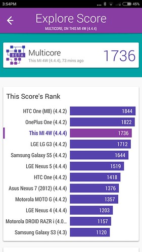
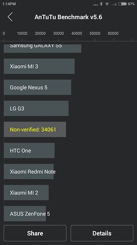
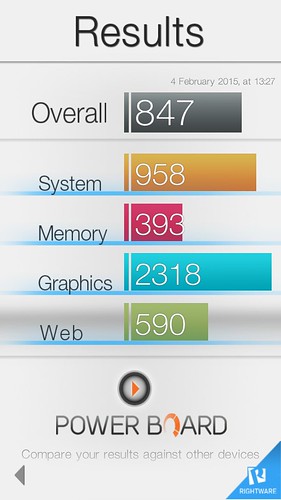
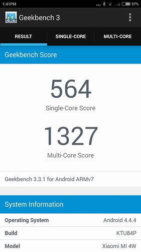
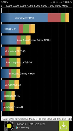
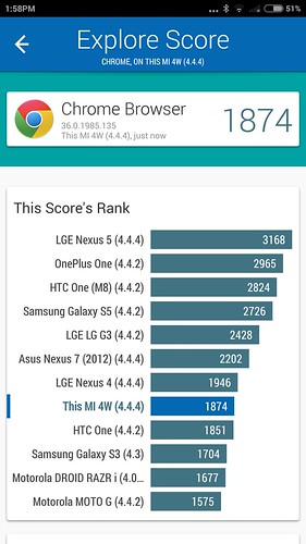
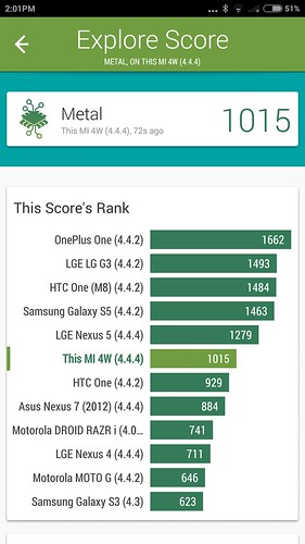
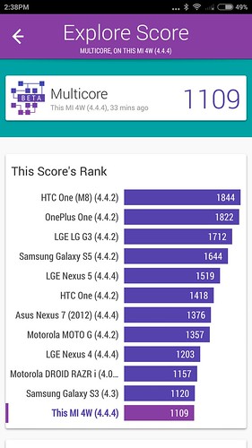
I should also note that the Mi 4 has two performance ‘modes’ available. In the battery menu, there’s a “Balanced” mode (which is the default), and a “Performance” mode. As you can tell from the name, the balanced mode is more conservative and caps the maximum clock speed of the processor cores, so as to conserve battery life. Then there’s the performance mode, which basically frees the processor do whatever it wants to do. As such, any benchmarks on the Mi4 are dramatically different depending on which mode it is in.
Here’s benchmarks in performance mode:
As you can see, in balanced mode the benchmark results are quite average, whereas in performance mode it is one of the best benchmark results you’d get from a smartphone right now.
As fantastic as all those specs are, the only disappointing thing about the Mi 4 is that there is no microSD card slot. Which means you’re limited to just the internal memory. Right now, only the 16GB version is on sale here in India, but hopefully the 64GB version will come along soon enough.
If space is not an issue for you, this will be manageable, but if you want more storage space, you’ll want to look at something like the OnePlus One instead.
Moving on, in terms of connectivity, there’s Bluetooth 4.0, 5GHz Wi-Fi, support for MHL, and an infrared blaster that can be used as a remote to control pretty any of your home electronics that work with IR remotes. There’s no NFC or LTE support (at least for India) though.
The Software:-
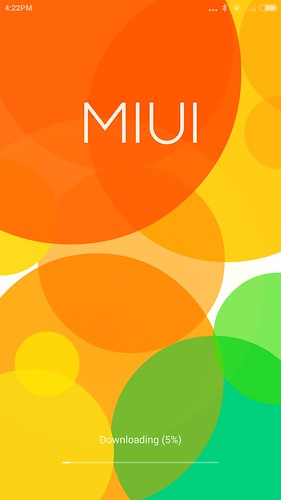
Xiaomi started out making software, not hardware. Their first product was MIUI, the company’s popular custom Android skin which is available for a whole bunch of non-Xiaomi smartphones as well.
As such, the Xiaomi Mi 4 runs MIUI v6, which is the latest iteration, based on Android 4.4.4 KitKat.
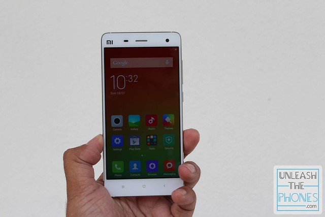
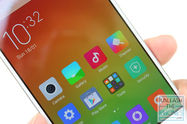
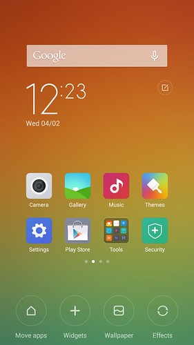
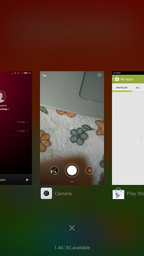
MIUI 6 is lightweight, filled with features, and even though it is very inspired by Apple’s iOS UI, it is one of the best executed Android skins currently available.
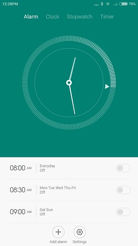
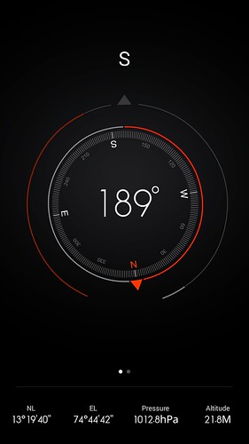
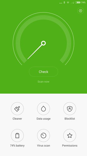
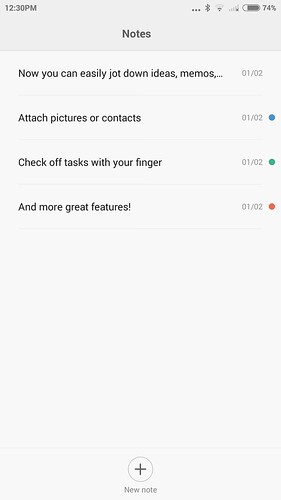
Everything is incredibly well done and beautiful, from the various animations that you come across when navigating around the UI, to the onboard apps such as the Compass, Calculator or Clock. There is emphasis on both function, and design.
Ofcourse the first thing you’ll notice about MIUI, is the lack of an app drawer. Yes indeed, there is no separate menu of apps, and all your icons and widgets are stored on the homescreen(s) instead.
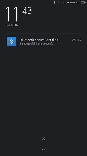
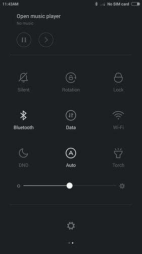
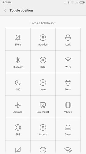
Apart from that, its very similar to most Android UIs, with a notification panel drop down which is smart enough to know when you need to get to the toggles instead (aka when there are no ‘priority’ notifications) or when you need to get to your notifications. So, for example, if you have missed calls or a new WhatsApp message, you’ll see that on the notification drop down, but if it is a new app update you’ll see the toggles.
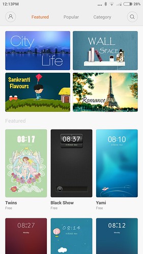
MIUI is also known for its Themes, which you can download more of, right from Xiaomi’s servers using the onboard themes apps. There’s tons of different free, and paid themes. Personally I think MIUI is gorgeous by itself, but hey, if you want to change it up, here ya go.
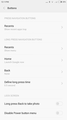
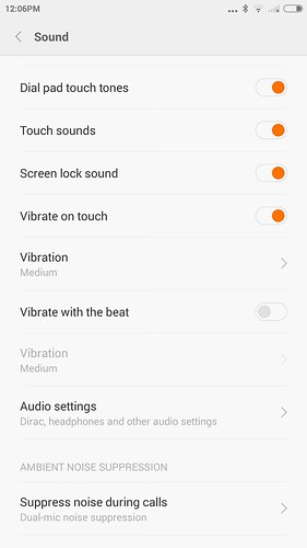
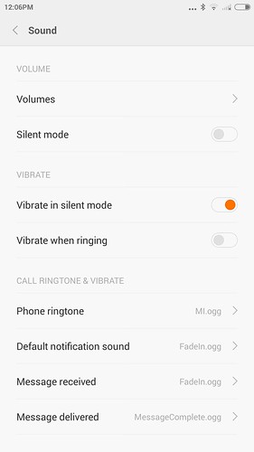
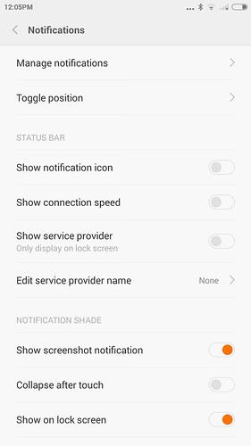
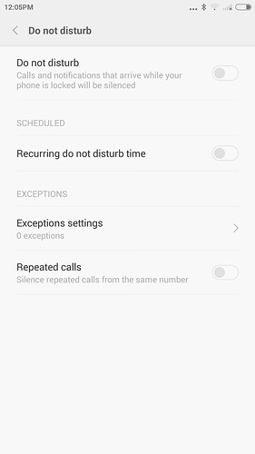
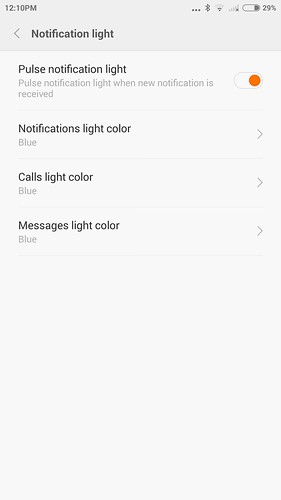
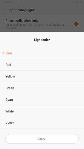
As you can guess, the themes are just one part of how customisable MIUI is. You also have the ability to customise what each button does (on short-press or long-press), to toggle which notifications to see, notification icons, what kind of battery indicator, the colour of the notification light (for calls, messages, and other notifications), and much more. In terms of functionality, there’s a do-not-disturb mode, and even the ability to unlock your phone without a security screen whenever a bluetooth device is connected (such as a headset or Android Wear).
As if all that wasn’t enough, there is no dedicated ‘gloves mode’ like on the previous Mi 3. Instead, the the Mi 4 screen will always register your touches, even if you’re wearing gloves, without the need to change any settings.
Moving on, messaging is easy enough thanks to the large-ish screen. The Mi 4 comes with SwiftKey and Fleksy pre-installed so the typing experience is great right out of the box.
It is interesting to see that MIUI has its own default browser built-in. It doesn’t handle heavy webpages as well as Chrome does (which is also pre-installed), but it does some some functionality advantages. For one thing, there’s a dedicated reader mode that helps you read content without distractions, and there’s also a ‘night mode’ which uses a dark theme. It also has the ability to compress data and save on your monthly data allowance.
Otherwise, Chrome is a better performer, and can sync with its desktop counterpart, so personally I prefer to use it instead.
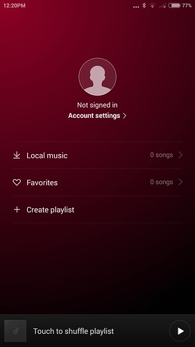
In terms of multimedia, MIUI has their own skinned versions of the gallery, video and music player apps. They’re pretty much your usual Android stock multimedia apps, except that they’re hooked into Xiaomi’s video service and Baidu’s (free streaming) music service if you’re interested in that sort of thing.
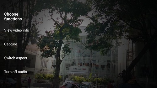
The video player is capable of playing back all sorts of formats, and even allows you to change the aspect ratio, depending on the video. The music player is pretty much what you’d expect, and has built-in lyrics support which is fun.
Music quality out of the Mi4 was pretty average, though the loudspeaker isn’t very loud.
The Camera Quality:-
The Xiaomi Mi4 boasts a rear camera that has a 6 lens, 13 megapixel, 1/3.06? Sony Exmor RS sensor (IMX214), with a very wide f/1.8 aperture lens and extremely quick auto-focus (which is supposed to be less than a third of a second).
As if that wasnt enough, at the front there’s an 8 megapixel camera with a 5-lens Sony Exmor R sensor with f/1.8 aperture.
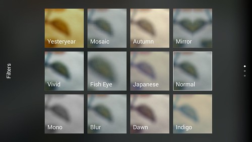
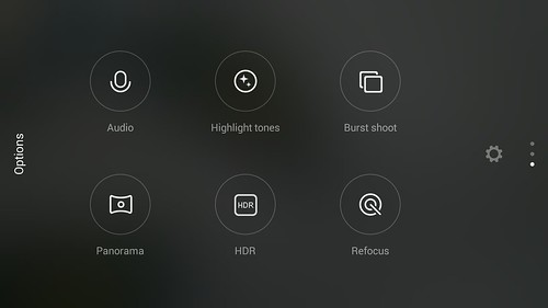
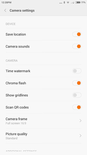
In terms of software, the MIUI camera has a lot of functionality, with a very easy to understand interface. You can even swipe left or right to get to the various filters or shooting modes, respectively.
Overall, image quality is pretty much what you’d expect for a phone in this category, though its not the best camera phone out there. Daytime images all had proper exposure and looked natural (though slightly warm), and there’s plenty of detail in each shot. Images generally looked great, but have typical-Sony blurring towards the edges, and some vignetting.
Pictures taken indoors were great, both in terms of exposure and color reproduction, even in situations were lighting was rather low. The flash module is a bit weak though, and it produces rather cold images with muted colors when used. Images taken in night time situations had a bit of noise, though there is a ‘handheld twilight mode’ to help make details a bit more visible.
The front facing camera is great for selfies, producing images that have lots of detail and accurate color reproduction and exposure. Still, there is room for improvement with it.
There’s also an HDR mode built-in to the camera app, but it has two kinds of HDR modes: Normal and Live. The normal HDR mode is what you’d usually get nowadays, and produces artificial looking but extremely dynamic stills.
The Live HDR mode results in images that looked rather faded in comparison, but the processing time is much quicker.
There’s a fun “Refocus” mode that allows you to take a picture with different focus points, so you can take a picture and change the focus later on.
And then there’s a “Manual” mode, which lets you tweak settings including focus, exposure, ISO, etc.
Lastly, there’s a panorama mode but it is limited to below 4 megapixels of resolution which is ridiculously low.
Here’s a couple camera samples to give you a better idea:
Sign up here with your email

.jpg)












ConversionConversion EmoticonEmoticon